I still remember refreshing my social media feed at 2am on the day Kojima dropped the first official promotional art for the long-awaited sequel. As someone who’s poured over 200 hours into the original Death Stranding, I immediately downloaded the high-res file and started zooming into every corner. The first official Death Stranding 2 poster is packed with more lore hints and teases than most 3-minute game trailers, and even months after its release, fans are still finding new tiny details they missed on first watch.
Key Visual Breakdown of the Official Death Stranding 2 Poster
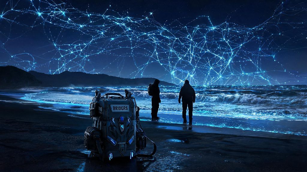
The poster is set on a familiar chiral beach, but almost everything about the scene is flipped from the visual language we got used to in the first game. For starters, the golden chiral network lines that crisscrossed the sky in the original’s promo art are now a cold, flickering blue, and they run from the shore out to the ocean instead of the other way around. Sam’s redesigned Bridges backpack has a big scratch over the classic Bridges logo, and he’s holding a delivery rope that’s half frayed at the end.
You’ll also spot the half-erased BB pod logo on the side of a wrecked delivery truck half-buried in the sand near Sam’s feet. That’s a huge hint that BB pods are no longer standard issue for porters, which lines up with comments Kojima made last year about the sequel moving away from the original’s core connection premise to explore what happens when those connections break. Fragile’s frost-covered cloak is another big tell: her timefall powers seem to have gotten stronger, but they’re also taking a bigger toll on her body, as you can see parts of her skin peeking through the cloak that are covered in timefall scars.
I noticed the chiral crystals scattered across the beach are also a different shade than the ones from the first game. They’re pale, almost translucent, instead of the bright red we saw before. Some fans think that means the chiral network is now corrupted, and the BTs are leaking into the living world at a much faster rate than before. It’s a small detail, but it changes the entire tone of the scene compared to the first game’s more hopeful promo art.
Hidden Character Teases You Probably Skipped
If you only looked at the main three figures in the foreground (Sam, Fragile, and the little girl standing next to Fragile), you missed half the fun. Kojima loves tucking tiny character silhouettes and hints in the background of his promo art, and this poster is no exception. I had to zoom to 400% to spot most of them, and even then I missed a few until other fans pointed them out online.
The most obvious tease is the unannounced masked character standing at the shoreline, half-hidden behind a chunk of chiral crystal. He’s wearing a black cloak that trails off into black chiral particles, which is a classic Higgs visual cue, but his mask is different from the one Higgs wore in the first game. A lot of fans think he’s a new villain, but I’m in the camp that thinks it’s a reformed Higgs working with a new faction that’s not aligned with Bridges.
Louise’s aging appearance confirming the time jump is another big detail a lot of people missed. The little girl next to Fragile is definitely Louise, the BB Sam was connected to in the first game, and she looks to be around 8 or 9 years old. That confirms the game is set at least 7 years after the end of the first game, which explains why so much of the world has changed.
There are a ton of smaller character teases scattered across the background too, after sifting through dozens of fan breakdowns, these are the three most likely confirmed characters hidden in the poster:
Of course, Kojima is famous for putting red herrings in his promo art, so there’s a chance one or more of these teases are fake. He added three fake character silhouettes to the original Death Stranding poster to throw leakers off, so I wouldn’t get too attached to any of these theories until we get an official confirmation.
Plot Clues That Hint at the Game’s Core Conflict
All the little visual details in the poster tie back to the core conflict Kojima has teased for Death Stranding 2: what happens when the connections you fought so hard to build fall apart. The frayed delivery rope Sam is holding is the most obvious visual metaphor for that, but there are dozens of smaller clues scattered across the scene.
The reversed Bridges logo painted on the wrecked delivery truck is a huge hint that Bridges is no longer the dominant unifying force it was in the first game. Some fans think the organization split into two factions, one that wants to keep the chiral network running, and another that wants to shut it down entirely to stop the BTs from spreading. That would explain why Sam’s backpack has a scratch over the Bridges logo, he might have left the organization or be working with a rogue faction.
The lack of BB pods on most of the background porters’ backpacks is another big plot clue. In the first game, every porter needed a BB to detect BTs, but if BBs are no longer standard issue, that either means people have found a new way to detect BTs, or they’ve stopped trying to avoid them entirely. The dead beached whales scattered across the shore are twice the size of the ones we saw in the first game, too, which hints that BTs are now much more powerful and common than they were before.
So much of the poster’s visual language is the opposite of what we saw in the original’s promo art. The first game’s posters had bright sunlight, intact delivery trucks, and porters working together to connect the country. This poster has grey, overcast skies, wrecked equipment, and porters walking alone, no groups in sight. It’s a clear signal that the sequel’s tone is going to be much darker, and the stakes are going to be way higher than just reconnecting America.
What the Poster Doesn’t Tell Us (And What We Can Guess Next)
For all the hints the poster gives us, there are still a ton of big gaps we don’t have answers for yet. First off, we don’t get any clear hint at Cliff’s return, which is a surprise for a lot of fans who expected him to play a big role in the sequel. I don’t think that means he’s not going to be in the game, though. Kojima loves saving big character reveals for trailers, not posters, so I’d put good money on Cliff being a late-game surprise twist that won’t be promoted ahead of launch.
The absence of any multiplayer-related iconography is another big gap. The first game’s multiplayer features were a huge part of its appeal, and Kojima has said the sequel’s multiplayer is going to be much more ambitious. We don’t see any signs of shared structures, player-made roads, or other porter signs in the poster, which makes me think the multiplayer features will tie into the core conflict of broken connections. Maybe you’ll have to work harder to connect with other players, or you’ll have the option to disconnect from the network entirely and play completely solo.
We also don’t know what the glowing blue object Fragile is holding in her hand is. It looks like a modified BB pod, but it’s much smaller than the ones from the first game, and it’s glowing instead of showing a baby inside. Some fans think it’s a new type of chiral device that can reverse timefall damage, while others think it’s a piece of the old network that Fragile is trying to protect. We’ll probably get an answer to that when the next full trailer drops, which is rumored to be at the next Game Awards show if Kojima sticks to his usual release schedule.
One thing I will say is don’t trust every leak or theory you see online about the poster. I’ve seen dozens of fans claim they spotted everyone from Norman Reedus’s other characters to Hideo Kojima himself hidden in the background pixels, and most of those are just people seeing what they want to see. The only way to spot real clues is to compare what you see to the established lore from the first game, and remember that Kojima always adds a few fake details to keep people guessing.
At the end of the day, the Death Stranding 2 poster is a perfect example of why Kojima’s promotional material is so beloved by fans. It doesn’t just show off pretty art, it tells a whole story on its own, and it gives fans months of content to pick apart and discuss while they wait for the game to launch. If you haven’t gone through the high-res version yourself yet, I highly recommend setting aside 20 minutes to zoom through every corner, you’ll almost certainly find a detail no one else has posted about yet. I know I’m still finding new tiny hints every time I look at it, and I can’t wait to see how all of them play out when the game finally drops.